🔥🤯 HTML、CSS、JSを使ったすごいポートフォリオウェブサイト
初心者でもプロでも、印象的なポートフォリオを作りたい人に向けたブログです。このチュートリアルでは、HTML、CSS、JSを使ってモダンな見た目のポートフォリオウェブサイトを自分で作る方法を学びます。記事では、ナビゲーションでのスムーズなトランジションの作り方、教育と経験を紹介するCSSタイムラインの作り方、カッコいいホバーエフェクトのあるプロジェクトセクションを作る方法を学びます。このポートフォリオを作れば、リクルーターに強い印象を与えることができます。
それでは、これ以上時間を無駄にせずに始めましょう。プロジェクトのデモを見るか、コードの理解を深めたい場合は、下のチュートリアルをご覧ください。
YouTubeチャンネルを登録してサポートしていただけると嬉しいです。
それでは、サイトのナビバーを作るために開始しましょう。その前に、ファイルとフォルダについて知っておくべきことがあります。

画像はこちらからダウンロードできます。
ナビバー
さあ、ナビバーを作り始めましょう。まず、HTMLの基本テンプレートを書いて、style.cssとapp.jsファイルをindex.htmlファイルにリンクします。これが終わったら、ナビバーを作ります。
<!-- navbar -->
<nav class="navbar">
    <ul class="link-group">
        <li class="link active"><a href="#">ホーム</a></li>
        <li class="link"><a href="#">プロジェクト</a></li>
        <li class="link"><a href="#">約</a></li>
        <li class="link"><a href="#">連絡先</a></li>
    </ul>
</nav>
フルスクリーンモードを終了
さて、HTMLが終了したので、いくらかスタイルを追加しましょう。
*{
    margin: 0;
    padding: 0;
    box-sizing: border-box;
}

body{
    width: 100%;
    max-width: 1400px;
    display: block;
    margin: auto;
    min-height: 100vh;
    background: #191919;
    font-family: sans-serif;
}

.navbar{
    width: 100%;
    position: fixed;
    top: 0;
    left: 0;
    display: flex;
    justify-content: center;
    align-items: center;
    z-index: 9;
    background: #1a1a1a;
}

.link-group{
    list-style: none;
    display: flex;
}

.link a{
    color: #fff;
    opacity: 0.5;
    text-decoration: none;
    text-transform: capitalize;
    padding: 10px 30px;
    margin: 0 20px;
    line-height: 80px;
    transition: .5s;
    font-size: 20px;
}

.link a:hover, .link.active a{
    opacity: 1;
}
フルスクリーンモードを終了
これで終わりましたら、以下のような見た目になるはずです。

OKです。ナビバーできました。次にホームセクションに進みましょう。
ホームセクション
ホームセクションを作るため、ナビバー要素の後に次のHTML構造をコードしましょう。
<!-- home section -->

<section class="home-section active">
    <h1 class="hero-heading">こんにちは、私は<br>くなあるです</h1>
    <img src="img/home.png" class="home-img" alt="">
</section>
フルスクリーンモードを終了
それにスタイルを加えてください。
.home-section{
    width: 100%;
    height: 上記コードを参考100vh;
    padding: 0 150px;
    display: flex;
    align-items: center;
    position: relative;
    top: 0;
    opacity: 0;
    transition: 1s;
}

.hero-heading{
    color: #fff;
    font-size: 120px;
    text-transform: capitalize;
    font-weight: 300;
}

.home-img{
    position: absolute;
    top: 0;
    right: 0;
    height: 100vh;
    width: 50%;
    object-fit: cover;
    opacity: 0.2;
}
フルスクリーンモードを終了
上のコードを見ると、.home-sectionにposition: relativeとtop: 0があります。これらのプロパティはナビゲーション時に重要です。なぜなら、ナビゲーションの動作が少し複雑だからです。すべてのセクション(ホーム、プロジェクト、約、連絡先)はposition: fixedになります。これにより、すべてのセクションがお互いの上に重なります。そして、activeクラスを使ってアクティブセクションを示します。activeクラスを使用して、セクションのpositionをrelativeに設定し、その不透明度を1にします。これがナビゲーションの動作方法です。複雑でしょ?
出力

ホームセクションが終わったら、そのpositionをrelativeからfixedに変更してください。
.home-section{
    /* 以前のスタイル */
    position: fixed;
}
フルスクリーンモードを終了
その後activeクラスのスタイルを作ってください。
.home-section.active,
.project-section.active,
.about-section.active,
.contact-section.active{
    position: relative;
    opacity: 1;
    z-index: 8;
}
フルスクリーンモードを終了
ここで、スムーズなナビゲーションのために、すべてのセクションを追加したことに注意してください。
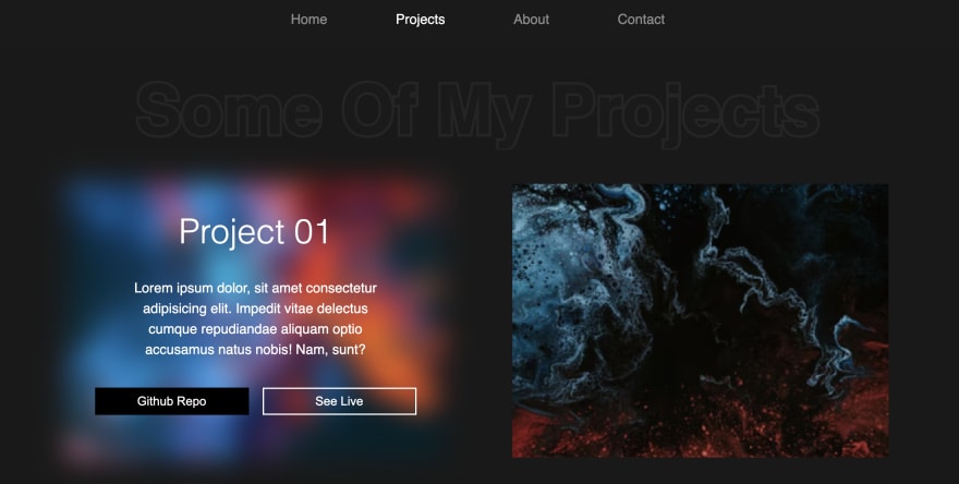
プロジェクトセクション
それでは、プロジェクトセクションを作りましょう。そのため、以下のようなHTMLをコードしてください。
<!-- project section -->
<section class="project-section">
    <h1 class="project-heading">私のいくつかのプロジェクト</h1>
    <div class="project-container">
        <div class="project-card">
            <img src="img/project-1.png" class="project-img" alt="">
            <div class="project-content">
                <h1 class="project-title">プロジェクト 01</h1>
                <p class="project-info">
                    Lorem ipsum dolor, sit amet consectetur adipisicing elit. Impedit vitae delectus cumque repudiandae aliquam optio accusamus natus nobis! Nam, sunt?
                </p>
                <div class="project-btn-grp">
                    <button class="project-btn github">GitHubリポジトリ</button>
                    <button class="project-btn live">ライブで見る</button>
                </div>
            </div>
        </div>
        // 他に3枚のカード
    </div>
</section>
フルスクリーンモードを終了
それにスタイルを加えてください。
/* project-section */

.project-section{
    width: 100%;
    min-height: 100vh;
    padding: 150px 100px 100px;
    position: fixed;
    top: 0;
    transition: 1s;
    opacity: 0;
}

.project-heading{
    font-size: 100px;
    background: #252525;
    text-transform: capitalize;
    text-align: center;
    margin-bottom: 50px;
    color: #1a1a1a;
    background-clip: text;
    -webkit-background-clip: text;
    -webkit-text-stroke: 8px transparent;
}

.project-container{
    display: grid;
    grid-template-columns: repeat(2, 1fr);
    grid-gap: 100px;
}

.project-card{
    height: 400px;
    position: relative;
}

.project-img{
    width: 100%;
    height: 100%;
    position: absolute;
    top: 0;
    left: 0;
    object-fit: cover;
    transition: .5s;
}

.project-content{
    position: relative;
    padding: 40px;
    color: #fff;
    transition: .5s;
    opacity: 0;
}

.project-title{
    font-size: 50px;
    text-transform: capitalize;
    text-align: center;
    font-weight: 300;
}

.project-info{
    margin: 40px;
    font-size: 20px;
    line-height: 30px;
    text-align: center;
}

.project-btn-grp{
    display: grid;
    grid-template-columns: repeat(2, 1fr);
    grid-gap: 20px;
}

.project-btn{
    height: 40px;
    text-transform: capitalize;
    font-size: 18px;
    border: none;
    background: #000;
    color: #fff;
    cursor: pointer;
}

.project-btn.live{
    background: none;
    border: 2px solid #fff;
}

.project-card:hover .project-img{
    filter: blur(20px);
}

.project-card:hover .project-content{
    opacity: 1;
}
フルスクリーンモードを終了
上のコードでは、project-sectionにすでにfixed位置を追加し、不透明度を0に設定しています。しかし、出力を見るためには、activeクラスをproject-sectionに以下のように追加してください。
<section class="project-section active">
フルスクリーンモードを終了
ホバー効果付きの出力
ナビゲーション
さてこれで前進する前に、まず最初にナビゲーションシステムを作りましょう。それには、app.jsファイルに次のコードを入力します。
const links = document.querySelectorAll('.link');
const sections = document.querySelectorAll('section');

let activeLink = 0;

links.forEach((link, i) => {
    link.addEventListener('click', () => {
        if(activeLink != i){
            links[activeLink].classList.remove('active');
            link.classList.add('active');
            sections[activeLink].classList.remove('active');

            setTimeout(() => {
                activeLink = i;
                sections[i].classList.add('active');
            }, 1000);
        }
    })
})
フルスクリーンモードを終了
上記のコードで、まずすべてのリンクとセクションを選んでいます。次にactiveLinkという変数を定義し、これは現在のアクティブセクションまたはリンクを追跡します。その後、forEachメソッドを使ってすべてのリンクをループします。その中では、各リンクとそのインデックスにアクセスします。
中では、addEventListenerを使ってリンクにクリックイベントを追加します。そして、ユーザーがアクティブリンクをクリックしていないことを確認するためのシンプルな条件を使います。その後、classList.removeを使って現在のアクティブリンクからactiveクラスを削除し、classList.addを使ってクリックされたリンクにactiveクラスを追加します。同じことをして、アクティブセクションからactiveクラスを削除します。
その後、setTimeoutを使って以下のコードの実行に1秒の遅延を入れます。タイムアウトの中では、単に再びアクティブクラスを追加しています。
ナビゲーションはとても簡単だと思うかもしれませんが、このプロジェクトで作ったものの中で二番目に難しいものでした😅
アバウトセクション
それでは、アバウトセクションを作りましょう。正直なところ、このウェブサイト全体で私のお気に入りのセクションはこのアバウトセクションです。私たちのアバウトセクションにはすべてがあります。スキルセクションがあるだけでなく、教育のタイムラインもあります。
アバウトセクションを作るため、project sectionの後にこのコードを書いてください。
<!-- about section -->
<section class="about-section">
    <div class="about">
        <div class="about-img-container">
            <img src="img/home.png" class="about-img" alt="">
            <button class="download-cv-btn">履歴書をダウンロードする</button>
        </div>
        <p class="about-info">Lorem ipsum.....</p>
    </div>
</section>
フルスクリーンモードを終了
それにスタイルを加えてください。
/* about-section */

.about-section{
    width: 100%;
    min-height: 100vh;
    padding: 150px 100px 0;
    position: fixed;
    top: 0;
    opacity: 0;
    transition: 1s;
}

.about{
    width: 100%;
    display:<br><br>こちらの記事はdev.toの良い記事を日本人向けに翻訳しています。<br>[https://dev.to/themodernweb/amazing-portfolio-website-using-html-css-and-js-l8f](https://dev.to/themodernweb/amazing-portfolio-website-using-html-css-and-js-l8f)